Most web development projects fail before a single line of code is written.
They fail in the gap between design and development — that invisible handoff moment where a beautifully crafted Figma file gets passed to a developer who interprets it as a visual specification rather than a conversion instrument. The animations get simplified. The spacing gets approximated. The micro-interactions that were designed to guide a visitor's attention get dropped because "that would take too long." The hierarchy that made the CTA obvious in Figma becomes ambiguous in the browser.
The result is a website that looks like the design but does not perform like it was supposed to. Traffic arrives. Visitors browse. Leads do not come.
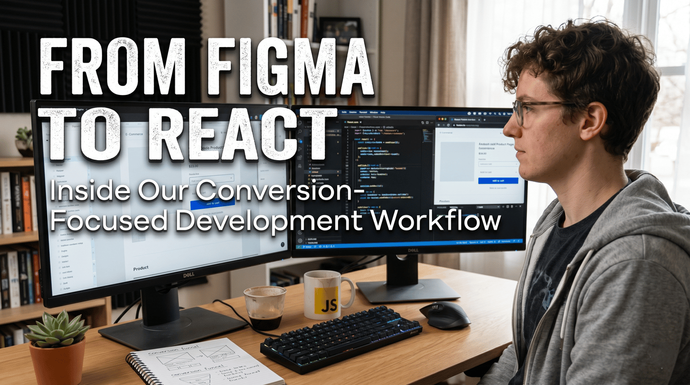
At Calsinas, our Figma to React development process was built specifically to eliminate this failure mode. Every stage of our workflow — from the first design frame to the final deployment — is organised around a single question: does this decision move a qualified visitor toward conversion?
This article documents that workflow in full. Not as a sales document, but as a genuine transparency exercise — because we believe the way a web development agency works is as important as what it produces.
Why Most Figma-to-Development Handoffs Break Conversion
Before describing our process, it is worth being precise about where conventional workflows go wrong. Understanding the failure modes is the first step toward systematically eliminating them.
The Visual-Fidelity Trap
Most design-to-development workflows are evaluated on visual fidelity. Does the live site look like the Figma file? This is the wrong success metric. Visual fidelity and conversion performance are independent variables. A site can achieve near-perfect visual fidelity to its design and still convert at 0.8% because the design itself was evaluated on aesthetics rather than buyer psychology, or because the subtle interactive cues that made the design feel alive were lost in implementation.
Conversion-focused UI/UX design agency work is evaluated on a different metric: does the live site move the right visitors toward the right actions at the highest possible rate? Visual fidelity is a constraint, not the objective.
The Developer-as-Executor Problem
When developers receive a Figma file without conversion context — without understanding who the buyer is, what their objections are, what journey they are on, and what the site is asking them to do — they make hundreds of micro-decisions during implementation that collectively determine the site's conversion performance.
Should this section have more padding? Should this button be primary or outlined at this scroll depth? Should this testimonial appear before or after the pricing section? Should this form have three fields or five?
Developers making these decisions without conversion context make them based on implementation convenience or personal aesthetic preference. Each individual decision is minor. Their cumulative effect on conversion rate is significant.
The Responsive Collapse Problem
Figma designs are almost always created at desktop breakpoints. The mobile implementation — where the majority of initial B2B research traffic arrives — is often treated as a layout problem to solve after the desktop build is complete. Responsive CSS is applied. Elements stack. The layout technically works.
But mobile conversion is not a layout problem — it is a hierarchy problem. What information should appear first on a 390px screen? Which CTAs should be sticky? Which content should be collapsed? These are conversion architecture decisions that require deliberate design, not automatic responsive adjustment.
In conventional workflows, mobile conversion is an afterthought. In ours, it is a first-class design and development concern from the first frame.
Stage 1: Conversion Discovery — Before Any Design Begins
Our B2B website design workflow India does not start in Figma. It starts with a structured discovery process that establishes the conversion architecture before visual design decisions are made.
Buyer Journey Mapping
We map the specific journey a qualified buyer takes from first awareness to conversion decision. For B2B clients, this journey typically spans multiple sessions, multiple devices, and multiple stakeholders. The website must perform differently for a first-time visitor exploring options, a returning visitor comparing vendors, and a decision-maker doing final due diligence.
Each stage of this journey has different information needs, different trust requirements, and different conversion actions. The website architecture — page structure, navigation logic, content sequencing — is designed to serve all three stages simultaneously.
Objection Inventory
Every B2B buyer has objections. Price concerns. Confidence in the vendor's capability. Uncertainty about implementation complexity. Risk of switching from an existing solution. Fear of project delays.
We document the full objection inventory for each client's buyer through stakeholder interviews, review of sales conversation records, and analysis of competitor positioning. These objections are then addressed explicitly in the site architecture — not buried in an FAQ page but woven into the primary content hierarchy where they arise naturally in the buying decision.
Conversion Action Hierarchy
Not all conversions are equal. A contact form submission is more valuable than a newsletter sign-up. A pricing page visit is a stronger intent signal than a blog page visit. A case study download from an identified company is more valuable than an anonymous page view.
We define a conversion action hierarchy for every project — primary conversion, secondary conversion, micro-conversion — and design the entire page architecture to funnel visitors toward higher-value actions based on their engagement signals.
This conversion hierarchy becomes the brief for visual design. Every design decision is evaluated against it.
Stage 2: Component Architecture Planning
Once the conversion architecture is established, we plan the React component system before opening Figma. This sequence — architecture before design — is one of the most important differentiators in our workflow.
Design Token System
We establish the design token system first: colour palette, typography scale, spacing system, border radius, shadow values, animation timing curves. These tokens are defined as CSS custom properties that are shared between the Figma design file and the React codebase. When a designer uses the primary colour token in Figma, that same token maps directly to the CSS variable in the React component. This eliminates the approximation problem where developers re-implement design values by eye.
Component Inventory
Before design begins, we inventory the component types the site will require: hero variants, feature sections, testimonial blocks, pricing tables, case study cards, navigation patterns, form components, modal systems. Each component is scoped as a reusable unit with defined variants, states, and responsive behaviours.
This inventory serves two purposes. First, it prevents design inconsistency — every instance of a testimonial block across the site uses the same component, ensuring visual and functional consistency. Second, it creates a shared vocabulary between designers and developers that eliminates ambiguity during implementation.
Interaction Specification
For every interactive element — hover states, focus states, transition animations, scroll-triggered reveals, form validation feedback — we write interaction specifications before design begins. These specifications define timing, easing, trigger conditions, and fallback behaviour for reduced-motion preferences.
Interactions are not designed in isolation during visual design and then handed to developers to approximate. They are specified as a system, designed to that specification, and implemented against that specification. The animation that appears on the live site is the animation that was intended — not a developer's interpretation of what the designer probably wanted.
Stage 3: Conversion-Focused Visual Design in Figma
With conversion architecture and component system established, visual design in Figma operates within a defined framework rather than from a blank canvas. This constraint is productive — it focuses creative decisions on differentiation and brand expression rather than structural reinvention.
Visual Hierarchy as Conversion Instrument
Every page in our Figma design is reviewed against a visual hierarchy audit: if a visitor spends three seconds on this page, what is the single thing they will notice? Is that the right thing for conversion? If a visitor spends thirty seconds, what is the secondary message they will absorb? Does that message address their most likely objection at this stage of the buyer journey?
Visual hierarchy — achieved through scale, colour, contrast, whitespace, and motion — is the primary tool for directing visitor attention toward conversion actions. In our workflow, visual hierarchy decisions are made explicitly rather than intuitively, with conversion context as the evaluation standard.
Mobile Design as Primary, Not Afterthought
We design mobile layouts as a parallel track, not a responsive adaptation. Mobile frames are designed concurrently with desktop frames. Where content hierarchy needs to change for mobile — not just layout, but what appears above the fold, what CTAs are accessible without scrolling, what content is collapsed — these decisions are made in Figma rather than in CSS.
The result is a mobile experience that was designed, not defaulted.
Annotation for Development Intent
Every Figma frame in our handoff is annotated with development intent — not just "this button is green" but "this CTA should be sticky on mobile below 768px," "this section fades in on scroll with 0.4s ease-out when 20% of the element enters the viewport," "this testimonial carousel auto-advances every 5 seconds but pauses on hover and respects prefers-reduced-motion."
These annotations eliminate the developer interpretation problem. Implementation decisions are made in design, documented in Figma, and executed in React without ambiguity.
Stage 4: React Development Against Conversion Specification
Our React development phase is not a translation exercise — it is a precision engineering engagement against a detailed conversion specification.
Component-First Development
Development begins with the component library, not with pages. Each component is built in isolation — tested across breakpoints, validated against Core Web Vitals impact, reviewed for accessibility compliance (WCAG 2.1 AA) — before being assembled into pages.
This sequence means that by the time pages are assembled, the components are known-good units. Page-level issues are compositional, not component-level, and are faster to resolve.
Performance Budgets Per Component
Every component ships with a performance budget — maximum JavaScript bundle size contribution, maximum render time, maximum cumulative layout shift contribution. If a proposed implementation exceeds the budget, we find an alternative before it enters the codebase. Performance is not audited at the end of the project; it is enforced throughout.
Animation Implementation with GSAP Precision
For clients requiring premium interactive experiences, we implement animations using GSAP (GreenSock Animation Platform) — the industry standard for web animation quality. GSAP animations are specified precisely, respect user motion preferences, are tested across device performance tiers, and do not contribute to Total Blocking Time through unoptimised JavaScript execution.
The difference between a Calsinas-built animated section and a CSS transition dropped in by a generalist developer is the difference between an experience that feels premium and one that feels broken on a mid-range Android device.
Conversion Element Implementation
CTAs, forms, and lead capture elements receive specific engineering attention:
Form fields are implemented with native keyboard types on mobile (email input triggers email keyboard, phone input triggers numeric keyboard)
Form validation is inline and real-time — errors appear as the user moves between fields, not after submission
CTA buttons have precise hover and active states that communicate interactivity clearly
Above-the-fold load time for pages containing primary CTAs is prioritised in Next.js build configuration
These are not cosmetic details. Each one has documented impact on form completion rates and CTA click-through rates.
Stage 5: Conversion Validation Before Launch
Before any Calsinas-built website goes live, it passes a conversion validation checklist that covers:
Core Web Vitals: LCP under 2.5s, INP under 200ms, CLS under 0.1 — validated in PageSpeed Insights field data simulation across mobile and desktop.
Conversion Path Audit: Every conversion path — from landing page to confirmation — is walked through on mobile, tablet, and desktop, on Chrome, Safari, and Firefox, with both fast and throttled network conditions.
Accessibility Audit: Keyboard navigation, screen reader compatibility, colour contrast ratios, and focus indicator visibility — because accessible websites convert better, rank better, and serve a wider audience.
Analytics Implementation: Google Analytics 4 event tracking is configured for all micro-conversions, scroll depth, CTA clicks, form starts, and form completions — so conversion data is available from day one rather than retroactively configured.
SEO Pre-Launch Checklist: Meta titles, descriptions, Open Graph tags, canonical URLs, schema markup, XML sitemap, robots.txt — verified against Google Search Console submission requirements.
What This Workflow Produces
The output of this workflow is not just a website. It is a conversion system — a precisely engineered digital asset where every decision, from the spacing of a headline to the timing of a scroll animation, has been made with intent and validated against performance standards.
For B2B website design workflow India clients, this means a site that does not just represent the business visually but actively participates in the sales process — building trust, addressing objections, qualifying intent, and driving conversion actions from the first session.
Final Word
The conversion-focused UI UX design agency label gets applied broadly in the Indian web development market. Most of the time, it means someone added a CTA button to a homepage template and called it conversion optimisation.
Real conversion focus is a discipline that runs through every stage of the design and development process — from discovery to deployment. It requires intentionality about buyer psychology, precision in design execution, and engineering rigour in implementation.
That is the workflow we have built at Calsinas. And it is the reason our clients' websites do not just look better than what they replaced — they perform measurably better from the day they launch.
If you want to understand what a conversion-focused Figma to React engagement would look like for your business, let's walk through it together.
Calsinas is a conversion-focused web development agency specialising in Figma to React development, B2B website design, and performance-engineered Next.js builds for Indian businesses and global exporters.